Guide Your Web Designer The Right Way

Designers won’t know your company at first, so you need to make a crash course about your business and vision. Collect this information before you begin your web design project. Good information leads to better websites, so do this stage right.
General Business Information | Websites You Like | What Content | Features | Photos and Video
General Business Information
Explain your main service or product as if you were talking to a client. List your email address, company phone, address, hours of operation, and social media sites. Explain your history, mission, things that make your company special. Be concise with each of these and keep your info under 3 pages of text.
Websites You Like
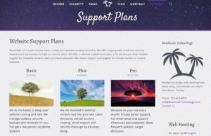
 Give your designer plenty of ideas but few constraints. Pick 3 websites you like the looks of and put them in a document. For each website, describe a feature you liked and also one you disliked, then describe why. This is my support plan page in the image. I like the colors, fonts, and the section with 3 images with the support plan details. I dislike the far-right column because it’s too complex and I don’t want to have to scroll down to see everything. Make your opinions crystal clear like this to get in sync with your designer.
What Content
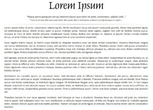
 Know the size of the site you want. A page is about 2-10 paragraphs with images. Break your site down into pages like the homepage, listing of services, staff listing, about us and contact us. Web designers expect these pages, but you should list any pages you want beyond these. This is an example of a large page made up of 5 large paragraphs and 393 words. This page is a bit too long, I’d prefer 250 words, but would be passable.
Features
Websites display information but they can do a lot more. Extra features allow us to tie in payment gateways to sell products, sell online courses with tests and certificates or take bookings for your services. Create a list of feature you’d like your website to have beyond displaying information.
Photos and Video
 Be real. Get many real photos to minimize the use of stock photos. Take multiple pictures of everything you can and pick the best of each. Phones work but photographers are better. Your products, services in action, before/afters, staff photos, your building, front door to office, delivery vehicles and smiling people. Video is harder to get right, but take a video or two if you can. Use stock photos to fill the gaps, and avoid cliche stock photos like Mac computers on wood tables with coffee.
Anyway, that’s it. Have a great day!